woodbutcherbower
Member
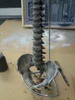
So it was time for the finishing stage. I approached this with a great deal of trepidation, since a) I've been in the game a long time, and I know that even the best-crafted piece of work can be trashed by a bad paintjob, and b) I possess the artistic ability of the average 5-year-old. Think along the lines of 'matchstalk men drawn with a Crayola' and you'll be right there in the ballpark.
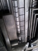
My three 'get out of jail' cards, however, were that 1) Giger uses a very limited colour palette - mostly greys, blues and browns, 2) His paintings often have a grimy, industrial appearance which would be very forgiving of my lack of ability, and 3) The art is done almost exclusively using an airbrush - a tool which I was already pretty familiar with. So I attacked the spine first with a pale grey/blue acrylic I'd mixed up. When it was dry, I painted over the whole thing with a diluted wash of very dark grey, and immediately wiped almost all of this off whilst it was still wet. To my great relief, this technique proved an instant success - the dark paint sat in all the recesses and made it instantly resemble the vibe of the original painting. Encouraged by this little victory, I repeated this technique over the whole thing;
[attachimg=1]
[attachimg=2]
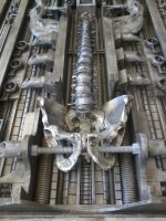
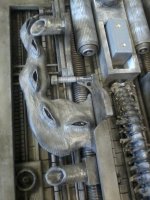
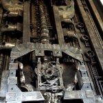
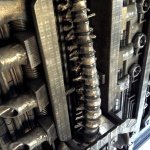
I spent a little time online studying various aspects of Giger's technique, and I noticed that a lot of his surfaces are covered with multiple repeating patterns which he'd obviously sprayed using a frisket mask. I still had some etchings left, so after a little practise, I went for it. I'd also noticed that his colours varied and faded in/out a lot, so I was constantly mixing up slightly different batches of colour and softly blending them all in;
[attachimg=3]
[attachimg=4]
[attachimg=5]
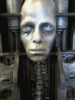
Painting the face proved to be difficult for me, and the version on the photo below was my 4th or 5th attempt. No matter what I tried - it just looked too flat. The "Yeeeeeehaa!" moment came when I figured that recessed stuff like eye sockets needed to be darker, and raised stuff like cheekbones needed to be lighter. It's probably Day #1 Lesson #1 in art school, but hey - I'd somehow blundered there unassisted;
[attachimg=6]
It was now time to give the fella his haircut. I already mentioned that I'm not an artist. I'm not a hairdresser either ......
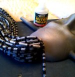
I'd bought a set of fake dreadlocks - these were initially painted pale grey, then each one was banded using a black Sharpie using a bunch of different ring patterns. It took forever. These were then fixed to the skull using more 2-pack cyanoacrylate;
[attachimg=7]
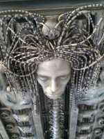
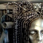
The client had asked for the hairdo to be 'part Hydra, part peacock's tail' - so this was achieved using a combination of cyano and pins. You may have noticed that the entire build is completely symmetrical - the hairdo had to be the same;
[attachimg=8]
The final task was to revisit the original painting - it had a kind of brown, murky look to it and mine was currently still various shades of grey & blue - so I mixed up a thin wash of dark brown acrylic and gently drifted it over the entire thing. This toned everything right down;
[attachimg=9]
[attachimg=10]
[attachimg=11]
And that's where I'm currently at with it. There's a little more to do, but I'm now away for a few days doing a repair job up on a remote Scottish Island (Islay actually, for the heavy-peated single malt lovers amongst you). I'll finish up and post pics of the final result when I get back. Thanks again to all who are still following this - and happy 4th July [wink]
My three 'get out of jail' cards, however, were that 1) Giger uses a very limited colour palette - mostly greys, blues and browns, 2) His paintings often have a grimy, industrial appearance which would be very forgiving of my lack of ability, and 3) The art is done almost exclusively using an airbrush - a tool which I was already pretty familiar with. So I attacked the spine first with a pale grey/blue acrylic I'd mixed up. When it was dry, I painted over the whole thing with a diluted wash of very dark grey, and immediately wiped almost all of this off whilst it was still wet. To my great relief, this technique proved an instant success - the dark paint sat in all the recesses and made it instantly resemble the vibe of the original painting. Encouraged by this little victory, I repeated this technique over the whole thing;
[attachimg=1]
[attachimg=2]
I spent a little time online studying various aspects of Giger's technique, and I noticed that a lot of his surfaces are covered with multiple repeating patterns which he'd obviously sprayed using a frisket mask. I still had some etchings left, so after a little practise, I went for it. I'd also noticed that his colours varied and faded in/out a lot, so I was constantly mixing up slightly different batches of colour and softly blending them all in;
[attachimg=3]
[attachimg=4]
[attachimg=5]
Painting the face proved to be difficult for me, and the version on the photo below was my 4th or 5th attempt. No matter what I tried - it just looked too flat. The "Yeeeeeehaa!" moment came when I figured that recessed stuff like eye sockets needed to be darker, and raised stuff like cheekbones needed to be lighter. It's probably Day #1 Lesson #1 in art school, but hey - I'd somehow blundered there unassisted;
[attachimg=6]
It was now time to give the fella his haircut. I already mentioned that I'm not an artist. I'm not a hairdresser either ......
I'd bought a set of fake dreadlocks - these were initially painted pale grey, then each one was banded using a black Sharpie using a bunch of different ring patterns. It took forever. These were then fixed to the skull using more 2-pack cyanoacrylate;
[attachimg=7]
The client had asked for the hairdo to be 'part Hydra, part peacock's tail' - so this was achieved using a combination of cyano and pins. You may have noticed that the entire build is completely symmetrical - the hairdo had to be the same;
[attachimg=8]
The final task was to revisit the original painting - it had a kind of brown, murky look to it and mine was currently still various shades of grey & blue - so I mixed up a thin wash of dark brown acrylic and gently drifted it over the entire thing. This toned everything right down;
[attachimg=9]
[attachimg=10]
[attachimg=11]
And that's where I'm currently at with it. There's a little more to do, but I'm now away for a few days doing a repair job up on a remote Scottish Island (Islay actually, for the heavy-peated single malt lovers amongst you). I'll finish up and post pics of the final result when I get back. Thanks again to all who are still following this - and happy 4th July [wink]
Attachments
-
 2.jpg601.5 KB · Views: 865
 -
 4.jpg721.9 KB · Views: 1,922
 -
 3.jpg543.5 KB · Views: 845
 -
 5.jpg591.7 KB · Views: 897
 -
 6.jpg489.5 KB · Views: 848
 -
 8.jpg402.4 KB · Views: 976
 -
 9.jpg370.9 KB · Views: 810
 -
 11.jpg802.3 KB · Views: 3,777
 -
 14.JPG1 MB · Views: 991
 -
 12.JPG1.2 MB · Views: 845
 -
 13.JPG1.2 MB · Views: 834