Mark Enomoto said:
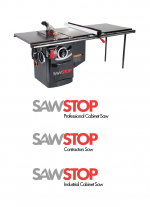
I wish Sawstop would work a bit more on their overall identity for such an amazing product. I understand the "intent" of the logo but think that it could have been executed in a much more subtle but still impactful way.
My wife owned a graphic design company and as she was the principal responsible for business development I heard lots of stories of her butting heads with the other principal who was a creative person that thought graphic design was as important as finding a cure for cancer.
I could care less about Sawstop's logo and visual identity. To me, the Festool green (which, unlike the subdued dark blue you describe - is what is primarily associated with Festool) to be gaudy and ugly, but I've bought lots of their tools. To be honest, I couldn't even tell you what Festool's logo looked like, if they have one, or what their font looks like.
Most people I've talked to seem to think the Sawstops are great looking saws, though I bet none of them bought the saw because of that. I also find Powermatic and General saws to be ugly, but I doubt they've lost many sales for due to their identity.
Sawstop differentiates itself by their technology, the high quality of their product, and their excellent customer support. They could have painted their saws pumpkin orange and I would still have bought it. Their manuals are workman-like inside, like Festools, but they go way beyond in the detail and coverage inside. I've never seen their marketing materials beyond their catalog and website, and I'd bet they'd lag behind Festool's, which are admittedly beautiful, but I'd like to think that I didn't buy Festool because of their marketing. And if so, I'd be happy if I saved a few bucks with less expensive marketing dollars spent.

