You are using an out of date browser. It may not display this or other websites correctly.
You should upgrade or use an alternative browser.
You should upgrade or use an alternative browser.
Shane,
Great work Shane! I do miss being able to hover my pointer over the subject in the unread messages window and being able to see the first sentence of the post. Helps when someone uses a subject that is not particularly clear to me,.
Thanks Shane
Jack
Great work Shane! I do miss being able to hover my pointer over the subject in the unread messages window and being able to see the first sentence of the post. Helps when someone uses a subject that is not particularly clear to me,.
Thanks Shane
Jack
nclemmons
Member
Nice work Shane. Much cleaner design.
Hope you can add back in location in the right column under the photos. It's nice to see where someone is located when responding to a post. Helps add context to the answer.
Appreciate the attention you show every day to this forum and it's members!
neil
Hope you can add back in location in the right column under the photos. It's nice to see where someone is located when responding to a post. Helps add context to the answer.
Appreciate the attention you show every day to this forum and it's members!
neil
Carl Prentiss
Member
- Joined
- Jan 3, 2013
- Messages
- 364
The issues with Youtube videos are fixed. Outstanding!
A
Administrator_JSVN
Guest
The location and join date are now listed under the profile info on posts and PMs.
Tapatalk had to be uninstalled and reinstalled on the server. In doing that, it likely lost your history for the app. I would suggest marking all read and then it should be fine moving forward.
Shane
Tapatalk had to be uninstalled and reinstalled on the server. In doing that, it likely lost your history for the app. I would suggest marking all read and then it should be fine moving forward.
Shane
SittingElf
Member
- Joined
- May 28, 2013
- Messages
- 1,369
Just a few things about the new template:
Overall, I like the more simplistic design, though it doesn't really reflect the Festool colors or pizazz.
The topic icons are extremely small. I also much prefer the older icons that were much easier to determine threads that I had posted in. The very small face on the responded threads is difficult to discern when doing a quick look from "unread". I realize that there is a "Replies" button, but sometimes it's nice to get all the unread threads and skim through them all.
The font now used for the topics and messages is VERY small on a Retina Mac. I don't want to have to change my resolution each time I visit FOG. The old system's fonts were just the right size and MUCH easier to read without squinting.
The order of info on the left is confusing. You now have Handle, followed by the avatar, followed by the location, and then whatever that generally refers to the avatar. (In my current avatar, it is a reference to my son's picture.) It would seem to make more sense to put the location in the same place it was on the last template....or last in line.
Avatar size has been reduced significantly and some details in those graphics are no longer discernible. I imagine that if this is to be the new locked size, that a number of members will be changing their avatars.
This is just my [2cents]. ( and thank you for keeping the "more" smileys!!)
Cheers,
Frank
AlexThePalex
Member
- Joined
- Nov 12, 2008
- Messages
- 7,757
I agree with SittingElf that the new font is a bit on the small size. Had to Control+ a couple of times (ie enlarge font in your browser). Luckily my browser (FireFox) remembers the setting for each website.
The avatars are the perfect size now. No more comic book feel where the pictures dominate the entire thread but are just an illustration to recognise the member, as it should be. The texts of the individual posts in the threads should always be the most important things to focus on.
I noticed the font of the quotes is smaller than the normal text. I'd prefer it were the same size, as it was on the old design. More comfortable to read.
Wait ..., what? First they say rats can't cook, now we can't play with power tools? The speciesism is strong in this one ..... [poke]
The avatars are the perfect size now. No more comic book feel where the pictures dominate the entire thread but are just an illustration to recognise the member, as it should be. The texts of the individual posts in the threads should always be the most important things to focus on.
I noticed the font of the quotes is smaller than the normal text. I'd prefer it were the same size, as it was on the old design. More comfortable to read.
tjbnwi said:Your profile picture is from an animation (I hope, if not.........)
Wait ..., what? First they say rats can't cook, now we can't play with power tools? The speciesism is strong in this one ..... [poke]
bkharman
Member
- Joined
- Jul 1, 2013
- Messages
- 2,019
Shane Holland said:Tapatalk had to be uninstalled and reinstalled on the server. In doing that, it likely lost your history for the app. I would suggest marking all read and then it should be fine moving forward.
Shane
I figured as much Shane. Thanks for the info. Also thanks for a killer interface... Like I said, very "modern web" looking.
For those who seem to be nitpicking every little thing that changed, you have to realize the effort Shane and others put into this release. There is a TON of good here.
Try contacting a forum admin on another site and see what they will change for you. Give this a few more weeks and most won't complain. Like anything new (and improved) many will fight the change and the easiest way to convey that is in this forum.
/rant
I know many others have said it Shane, but I will say it again, thank you for everything you do for festool and the eager folks on this forum... You go well above the job requirements.
Cheers. Bryan.
A
Administrator_JSVN
Guest
Yeah, like I said, it's going to be a progressive thing to add features and functionality back to the site. The main goal was to get the forum upgraded and back to 90% or so at least in less than 24 hours. I was up until 4am Friday morning working on it. [blink]
Regarding issues with the font size on Retina, what devices are you guys using where it appears small? It actually looks a little larger to me looking on my iPhone 5S.
What I will guarantee is that I won't be able to do every change that every person wants. But, hopefully, we will get a good consensus of what changes are important and go from there. The desire is to make it better than it was. I think we're already headed in that direction.
Shane
AlexThePalex
Member
- Joined
- Nov 12, 2008
- Messages
- 7,757
Shane Holland said:Yeah, like I said, it's going to be a progressive thing to add features and functionality back to the site.
As someone who's familiar with a couple of programming languages, I can say I know how it works Shane, and you're doing a good job. I myself am just giving you a few pointers with my comments. I think the update looks great.
Shane Holland said:Regarding issues with the font size on Retina, what devices are you guys using where it appears small? It actually looks a little larger to me looking on my iPhone 5S.
Fonts look small on my Windows 7 and XP computers. I know portable devices are the bomb right now, but I think internet forums should still have desktop computers as their main focal point. Certainly not phones, a 5'' or 7'' screen will never give you the experience of a 24". I know tablets and phones are a fad right now, and I have a couple of them, but they'll never come close to a desktop when pure functionality is concerned.
Shane Holland said:What I will guarantee is that I won't be able to do every change that every person wants. But, hopefully, we will get a good consensus of what changes are important and go from there. The desire is to make it better than it was. I think we're already headed in that direction.
Got it. The more people comment on what works for them and what doesn't, the more info you'll have to distill what the consensus is. I'd encourage everybody to tell here what they like and what they don't.
For instance, I just noticed the box where you compose your new post is even smaller than it was. [smile]
Keep going Shane, we understand it's a work in progress and you're doing just fine. Take your time. But I'd encourage you to check your work also on a desktop computer and not just an iPhone.
A
Administrator_JSVN
Guest
Alex, I have dual 24" monitors on my desktop and that's where I did a of the work on the template. The font was comparable in size, if not larger than before. I'll pull the old CSS file and check the previous font size to be sure.
I comment about it on my phone because Frank said it was hard to read on a Retina display.
I comment about it on my phone because Frank said it was hard to read on a Retina display.
Everything looks okay except the list of recent posts on the home page. I'm running on a Mac with the latest 'released' version of the OS and the list of recent posts is all jumbled based on the wide of the window in Safari. If I widen it, it gets worse, if I shrink it, it gets better but not totally. The rest looks ok.
Any suggestions?
Karl
Any suggestions?
Karl
Wooden Skye
Member
- Joined
- Mar 6, 2012
- Messages
- 1,145
The new format is good. Taking a while to get used to, but I think reading different posts are better, a lot cleaner. Great job Shane!!
A
Administrator_JSVN
Guest
kelauben said:Everything looks okay except the list of recent posts on the home page. I'm running on a Mac with the latest 'released' version of the OS and the list of recent posts is all jumbled based on the wide of the window in Safari. If I widen it, it gets worse, if I shrink it, it gets better but not totally. The rest looks ok.
Any suggestions?
Karl,
It should only appeared jumbled if you're screen resolution is less than 1024 pixels wide. That's the width of an iPad Mini in landscape, for instance. I can see if I can edit the CSS to make it self-correct for lower resolutions. But, I would have expected most folks to have a wider screen than that nowadays.
And, to clarify my statement about not being able to change everything that every person wants, since I was on my iPhone when I posted it... My meaning was that if I change something for one person it could conflict with the opinions of another. It was not to signal an unwillingness on my part to try to fix everything the best possible.
Shane
SittingElf
Member
- Joined
- May 28, 2013
- Messages
- 1,369
Regarding "Retina" from my previous post....
Sorry, I should have said Retina 15" Macbook Pro laptop, not phone or iPad.
Cheers,
Frank
Sorry, I should have said Retina 15" Macbook Pro laptop, not phone or iPad.
Cheers,
Frank
- Joined
- Nov 14, 2013
- Messages
- 3,574
Shane:
Generally I like the new look. Seems MUCH cleaner. And I finally figured out that the 'Replies' button replaces the old "Replies to your posts" or whatever it used to be called.
[embarassed]
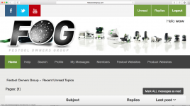
I have one complaint. There is so much going on at the top of each page that I can't even see a single post without scrolling down. That really irritates me.
Here's a screen shot to show what I mean:
[attach img #]
This is exactly - and ONLY - what I see when I visit the site. You may already have these planned as enhancements, but I wanted to mention them in case you hadn't thought of (or been bothered by) them yet.
I think you could easily get rid of SOME vertical space without messing up the look too bad. For instance, one the very top line with the social media links and the Unread / Replies / Logout buttons, the buttons don't have to be square. They could be rectangular - taking up less vertical space - and still look good.
But the area below the masthead that shows you where you are seems like it's wasting a HUGE amount of space. It is almost as large vertically as the masthead, but there are only two lines of text in it - the location you are at on the site, and the number of pages returned. Seems like that could EASILY fit in one quarter of the space that it takes up now?
It may be that nobody else sees this as an issue, but one of my 'golden rules of web design' is that your first page should show you your answer/result without having to do anything else...like scrolling down.
Otherwise, Thanks for all your hard work! I think I like it a lot and am starting to get used to it.
Generally I like the new look. Seems MUCH cleaner. And I finally figured out that the 'Replies' button replaces the old "Replies to your posts" or whatever it used to be called.
[embarassed]
I have one complaint. There is so much going on at the top of each page that I can't even see a single post without scrolling down. That really irritates me.
Here's a screen shot to show what I mean:
[attach img #]
This is exactly - and ONLY - what I see when I visit the site. You may already have these planned as enhancements, but I wanted to mention them in case you hadn't thought of (or been bothered by) them yet.
I think you could easily get rid of SOME vertical space without messing up the look too bad. For instance, one the very top line with the social media links and the Unread / Replies / Logout buttons, the buttons don't have to be square. They could be rectangular - taking up less vertical space - and still look good.
But the area below the masthead that shows you where you are seems like it's wasting a HUGE amount of space. It is almost as large vertically as the masthead, but there are only two lines of text in it - the location you are at on the site, and the number of pages returned. Seems like that could EASILY fit in one quarter of the space that it takes up now?
It may be that nobody else sees this as an issue, but one of my 'golden rules of web design' is that your first page should show you your answer/result without having to do anything else...like scrolling down.
Otherwise, Thanks for all your hard work! I think I like it a lot and am starting to get used to it.
Attachments
A
Administrator_JSVN
Guest
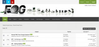
Wayne,
Your screenshot is 1679x941 pixels. At that resolution, you should be seeing a lot more than what's on your screen. I believe you may have your browser zoomed in. That could be causing you to see less of the page. Can you check that?
My notebook has a resolution of 1600x900 and I see a lot more in my browser.
[attachimg#]
Attachments
nclemmons
Member
Shane
I think Wayne raises a worthwhile point to explore.
There is a lot of 'brand and navigation chrome' at the top of the Festool Owners Group - links to social channels, headers, and then down to navigation. And it's on every page of the site. If you were to calculate that as a percentage of the page, it's higher than most sites. The bulk of it is the banner that includes the tool images and large FOG logo. But there are other areas as well that could be tightened up, assuming the BB platform gives you that flexibility, which could be the wrong assumption.
Here are a few quick estimates. The actual pixel counts may be off slightly but you'll get the idea.
FOG uses about 350 pixels within the browser window (below browser header, tabs, etc) for the page header until page content starts on the page.
By comparison, here's a few other 'informational sites' I just checked:
FestoolUSA uses about 160 pixels
CNN uses about 135 pixels
Amazon uses 110 pixels
Wikipedia uses about 86 pixels
NYT uses about 265 which includes ad banners and navigation
Reddit uses about 155 pixels
Garage Journal (another forum) uses a whopping 496 pixels of page depth on forum pages.
Curious what your analytics show as the average screen resolution depth is for a FOG visitor and what percentage of that depth the top brand and navigation space take up. I call it chrome because it's superfluous to the content.
Appreciate what you are doing, and know getting the forum stable and back to full functionality is a priority. But this might be something to look at in the future.
neil
A
Administrator_JSVN
Guest
The header has been reduced to just over 200px in height. Hopefully, that will be an improvement for those with low resolution or zoomed displays. That's on par with the previous layout of the forum.
Shane
Shane
Similar threads
- Replies
- 15
- Views
- 4K
- Replies
- 23
- Views
- 3K
- Replies
- 55
- Views
- 15K