New logo for Walk on Wood

This is my favorite. Remember to choose something that looks good in black and white, and scales well.

While I think the use of feet might be too much. I'd like to see one that has wood rings in the shape of a footprint.

77529_5020860_864283_image.jpg
 
Thanks Shane! That was my early favorite, but several people told me it was "boring" or "too plain". I think it's sophisticated and modern.
 
Walk On Wood said:
Thanks Shane! That was my early favorite, but several people told me it was "boring" or "too plain". I think it's sophisticated and modern.

Yes, I agree that it's elegant and will stand the test of time. Maybe consider asking your past customers their opinions.
 
The one Shane copied is nice, it is classic and not to busy.  I liked the one with the footprint best, but in my opinion the background was to dark.  Maybe you could do the foot print with a darker wood grain, white background maybe a border or something that resembles walking through a door way or threshold. 

 
Thank you for the feedback.. All of the colors are easily changed. The footprint designer was just showing it on the dark brown background (which I agree doesn't have quite enough contrast) I'm more concerned with the overall logo design.
 
I like the same one Shane chose.
It is very simple and it catches the eye at the same time it tells the whole story.
When i first started my landscaping biz, I could not get the guy who had designed my logo for the mason biz.  I found (was recommended) a woman who got carried way with too much in the design.  It was eye catching, but it just told too much.
Simplicity will catch the eye and be remembered for the story it tells.
Tinker
 
Another vote for the one Shane selected.  Elegant, yet plain, not too busy, not gimmicky........
 
I'd bump it back for another design round. If you'd going to have something visual it needs to "say" what you're about. These don't save for the timber footprints.
 
Tinker said:
Simplicity will catch the eye and be remembered for the story it tells.

Tinker: Well said! Every Logo/word mark tells a story.

I like the one that Shane picked as well, however we are not your current or future customers so really we are just voting on personal tastes (subjective) which really doesn't help you much other than to establish which is most popular.
The logo will probably work well if you want to appeal to the majority of people.
Remember a Camel is a horse designed by committee.

A logo or word mark should communicate values that customers you want to attract feel are important. You need to define who your customers are. Once you have some more information, you can brief the designer so they have some more information to work with.
 
[size=14pt]
I disagree with most of the comments below/above.
You are 'Walk on Wood' so walk on wood.

[attachimg=1]

Ie.  the middle image.
 

Attachments

  • image.jpg
    image.jpg
    28.3 KB · Views: 300
Untidy Shop said:
[size=14pt]
I disagree with most of the comments below/above.
You are 'Walk on Wood' so walk on wood.

[attachimg=1]

Ie.  the middle image.
+100
 
I tend to agree aitnShane,Tinker and Tim. Its a clear crisp design that will hold the customers attention
 
Untidy Shop said:
[size=14pt]
I disagree with most of the comments below/above.
You are 'Walk on Wood' so walk on wood.

[attachimg=1]

Ie.  the middle image.

I tend to vote for this one as well, but I need to ask a question. WHERE do you expect this to be VIEWED most often?

• Branded/printed on your finished floors?

• Business cards?

• Van or trailer?

The reason I ask is that I might have a slightly different opinion depending on the intended primary use.

And once you answer that, I agree that it might be wise to take another look at WHICHEVER design with that focus in mind.
 
Need more information before offering an opinion. Where are you located, what is your current clientele base, income bracket, age, gender that usually makes the decision, type of home and what are you targeting as next clientele, same different?. What medium(s) are you going to deploy this on.
 
Thank you for all of the feedback. This logo will be on all of my gear: shirts, business cards, my "leave behind" folders, mailers... Most likely not trucks, I don't like to advertise "expensive tools in here".  I am based out of NW suburban Chicago land. My target clients are high end custom homeowners looking for quality craftsmanship rather than the lowest cost. They tend to be in a higher income bracket.
 
I am about 95% convinced to go with the one Shane picked above.. Here are a few more representations of it:
 

Attachments

  • image.jpg
    image.jpg
    419.6 KB · Views: 211
  • image.jpg
    image.jpg
    227 KB · Views: 188
  • image.jpg
    image.jpg
    310.7 KB · Views: 212
The last representation has more warmth to it. This may be to much to add two little feet as a punctuation mark on it around "Hardwood floors", it would add that little touch that would make you stand out. That being said you are very close to it on that last representations.
 
Walk On Wood said:
I am about 95% convinced to go with the one Shane picked above.. Here are a few more representations of it:

I promised more input if you provided more info, so here it is - along with a solution:

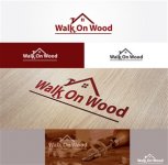
• The top design is a little contrived, i.e. it says 'WW' which is NOT 'Walk On Wood'

• Neither you nor any other business who is a FOGGER likely have the budget to make the design generally recognizable. Consider how much money would it take today to establish that a name like 'Pepsi' means a carbonated beverage?

SO - here's what I'd ask them to show me. I apologize that I have Zero photoshop skills so I'll just have to describe it:

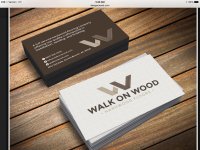
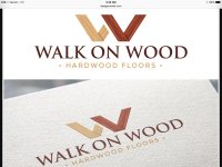
Take the 'Walk On Wood' LETTERS ONLY from the Middle design. Forget the roof.
Add the Hardwood Floors tag.

Again, apologies for my lack of graphic rendering ability, but maybe you can imagine what it would look like with this:

Walk On Wood      (with the stylized walking 'k')
• Hardwood Floors •


Reasons for my choice:

• the most important information - the name of your business - is 'loud and proud' - no guessing what a design means

• the stylized 'k' adds to your identity, showing - literally - walking on wood

• the stylized 'k' also adds an element of 'fun' and invites a comment and a personal connection

• Easily scalable, renders well in one or more colors, etc.

Finally, I'd get them printed on actual wood. There are several companies that do this and the cost for you - since you're catering to high-end clients - would be a small business expense but very memorable.

So - that's my 2¢ worth.
 
I like where you have evolved.  Classic.  Simple.  Tasteful.  High-End. 

Logos should convey the essence.  I am assuming that is craftsmanship, precision, care, and premium positioning.

Including walking shoes, footprints, hammers, a house outline, etc may not truly represent the essence of your work.

As to usage, I would suggest the W and Walk on Wood as a logo graphic lockup need to always be together.  You will never have the recognition of a Nike swoosh to not have the lockup.  Similarly, Hardwood Floors will need to always be there - on a van, door signage, etc. 

Nice work!

Wooden cards could be a nice idea.
 
Back
Top