Remember the fire-resistant firewood project?

Crazyraceguy

Member
Joined
Oct 16, 2015
Messages
4,887
The original post for this is some 7 or 8 pages back, from nearly a year and a half ago. It was one of the first parts of a pretty large, multi-phase job.
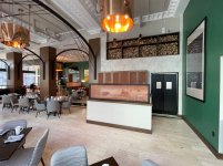
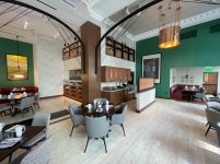
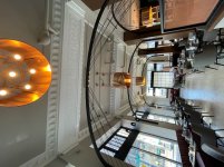
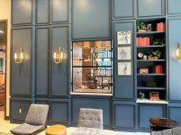
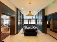
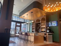
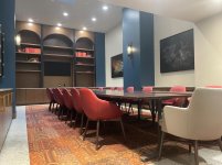
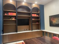
Well, the whole thing is done, and the place is open. One of the project managers went out and took some decent photos. They are not quite "lived in" yet, but somewhat fleshed out, not so stark as when the installers take pics.
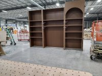
I still don't have all of them, since the Email was apparently too large and some of them were left off. I didn't realize that until I got home to check them.
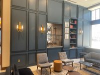
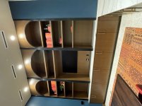
I will start with the firewood part, since it started all of this. It is way up high above an area I assume is a server station of some kind. It's in a huge, high ceiling room, yet the lower working area is somewhat screened. I made the screen frames and doors (but not the cabinets) along with the large column wraps.
 

Attachments

  • IMG_7889a.JPG
    IMG_7889a.JPG
    181.3 KB · Views: 102
  • IMG_7871a.JPG
    IMG_7871a.JPG
    194.4 KB · Views: 82
  • IMG_7881a.JPG
    IMG_7881a.JPG
    176.8 KB · Views: 75
  • IMG_7919a.JPG
    IMG_7919a.JPG
    185.9 KB · Views: 75
Then it goes down toward the bar area. This is where I built the brass clad bar wall itself and all of the arched cabinets behind it. You may remember some of these individual areas, not realizing thay they were all parts of the same job. The closer pics of the bar are some that I lost, but will be able to recover later.
From there it goes through a large opening, which I made, into a library-like lounge area. All of the blue panels on these walls are MDF panels, made in the shop, primed, then painted on-site. The screened opening goes through to the back side of the bar.
When I built those door jambs, I had no idea that they were so close to each other. They have some very expensive antiqued mirror in the transoms, that is not clear glass, but you can't really tell, from that angle.
 

Attachments

  • IMG_8030a.JPG
    IMG_8030a.JPG
    165.9 KB · Views: 63
  • IMG_8029a.JPG
    IMG_8029a.JPG
    182.7 KB · Views: 53
  • IMG_8044 1a.JPG
    IMG_8044 1a.JPG
    162 KB · Views: 56
  • IMG_7924a.JPG
    IMG_7924a.JPG
    125.6 KB · Views: 62
From there is goes into a more formal meeting room. I wish I had gotten to do the table, but they just shoved a bunch of smaller ones together. I assume to be more portable/adaptable, maybe even for cleaning reasons?
There are other areas, that I don't have pics for yet, but I also plan to go visit the site myself. Hopefully it will make things easier, by taking the pics on my phone, as I usually do. I still have to shrink them to post here, but it is far less work than adjusting these. They were taken by a better camera, with no regard for file size. I stared typing this up yesterday, but the files were so huge, it would only accept one, and by the time I figured out what was going on I had lost all I had written.
I split this up to make it less confusing, easier to reply too, easier to update. I hope it helps
 

Attachments

  • IMG_8004a.JPG
    IMG_8004a.JPG
    167.6 KB · Views: 58
  • IMG_8017a.JPG
    IMG_8017a.JPG
    156.1 KB · Views: 48
  • IMG_8020a.JPG
    IMG_8020a.JPG
    135.3 KB · Views: 52
It's really hard to appreciate the scale of these units, until you understand that the lowest shelf of the center opening is over 6' high then it sits on a counter top.

The case with the small squares openings is one of the places where I lost the pics too. It looks cool in-place filled and glass panels installed.


Attachments

  • ArdentTV6.jpg
    ArdentTV6.jpg
    412.9 KB · Views: 58
  • Ardent wall.jpg
    Ardent wall.jpg
    356 KB · Views: 55
Thanks for the big picture view!

Love the horizontal divides on the columns. A very simple space-defining thing that helps with construction too. May use it some day. The details to make that almost-monumental space feel cozy are great, excepting the firewood placement (see below).

On the whole:
---
The big space is very good, except the firewood (placement).

The firewood pieces look great at a distance, better than individually, but are placed at such an absurd location it kills the cozy tone they were to bring and instead works "faky" against it. A firewood stand needs to be "within reach". Works great as a space-divider, if on a wall it must at least start at a human-reachable height. Guess the interior designer is a city kid who never really handled firewood storage .. I understand the want to place something there for sound reflection/feature reasons but fake firewood is not a thing to put there.

I think probably the best area is the mini-saloon. Non-matching furniture hurts it, but it still retains an atmosphere.

The table set looks like it was moved from an old place by the wear and tear on them. That room would have been completely transformed by a matching table. Also the lightning should have been inside the furniture "arches", not in the ceiling in front of them. Or proper suspended lights, those can do wonders.

It all looks very "Corporate America" to me. Almost every single individual piece is nice-to-great but the whole has that "design salad" feel one usually produces when too much "value-for-money" thinking comes to play. Reminds me campus spaces during my studies. Were of a much lower quality but with the same "salad" feeling after 50+ years of partial refits.

To wrap it, the firewood should have been a space divider between columns and the conference room should have been done cheaper/simpler to save budget for the big space, bar or proper furniture for the mini-saloon. A (more) modest arrangement but taken all the way tends come out better than outstanding pieces set in an incomplete whole.
 
Thank you all. It was a lot of work but spread out over a reasonable time. There never was a rush, because the rest of the job was so far behind. Some of the things I built sat around the shop for months, to be shipped in phases, as needed.

[member=61254]mino[/member] I couldn't agree more. IMHO, the whole thing is a design mess. The obviously fake "books" on the shelves are offensive. The "too alike" color is bad enough, but the fact that they are so fake/flat is worse. Maybe this will be addressed in the future. The table thing is especially bad, and I didn't even post one of the pics that shows it the most.
I wouldn't mind the firewood as much if there actually was a fireplace. (As I said, I haven't been there yet, but none is obvious in the pics)
The brass "foil" on the front of the bar is a huge bad choice. It may look great today (which is debatable enough) but that stuff is so easily scratched, or otherwise damaged, that putting it right in the firing line is a giant mistake. It is also virtually impossible to repair, once it has been installed.
Hopefully, the objects on display will improve as it ages.

However, you are way off on the "value for money" aspect of it. Those brass light fixtures were insanely expensive and have a lead-time of months. (That's why the damaged one was hung anyway. They couldn't get a replacement in time) Those black archways? just as bad.
The stone tops on the bar, hardly inexpensive. As well as the partitions/screens. Those are a plated wire mesh. There are plenty of less costly ways to go about that.
To me, the corporate "cheap out" comes from the display items, but I get it, to some degree anyway.
This is a bar/restaurant/lounge for a hotel, open to the general public, not some corporate headquarters.
It's kind of not fair though, I am very much a frugal spender. I realize sounds contradictory to most people, considering my tools, but they don't get the false economy of cheap tools. (but that's a completely different discussion)
 
Crazyraceguy said:
..
However, you are way off on the "value for money" aspect of it. Those brass light fixtures were insanely expensive and have a lead-time of months.
...
Oh, I did not mean "cheap". Should have put it in quotes. Fixed.

I meant someone was making the calls who sees "brass fixtures" or "golden plating" as "value" but does not shy on cheaping-out on the fundamentals. Like not installing matching furniture or not paying for an interior lightning expert to match it all. Did not notice the faux books, but it does align into that mindset.
 
The workmanship is apparent, and quite beautifully done.  That bent light shade really offsets the rest of the effect.  Whoever did the photography could have used perspective correction to much better effect.  (Too bad that perspective correction could not have helped the bent light shade.)  [smile]
 
mino said:
Oh, I did not mean "cheap". Should have put it in quotes. Fixed.

I meant someone was making the calls who sees "brass fixtures" or "golden plating" as "value" but does not shy on cheaping-out on the fundamentals. Like not installing matching furniture or not paying for an interior lightning expert to match it all. Did not notice the faux books, but it does align into that mindset.

Yes, way more accurate (as I see it anyway)
I have been doing this for a long time, and I see how things are treated. Whether that is the general public or even the employees, people can be rough on things. Delicate items that would be fine in your home, don't work out so well in those conditions. A little forethought can go a long way.

I was just in a hospital today. They always have some kind of wall protection and corner guards in the hallways, usually around 42"-48" high. So, what do I see? a big scratch/gauge in the drywall, about 60" high. People can tear up anything.
 
Back
Top